Case Study
Client: Controliss®
Deliverables: brand thinking, brand audit, brand positioning, brand guidelines, graphic design, copywriting
Identity

We typically break the task of creating graphic identities (or logos) into four fundamentally different solutions; typographic, literal, abstracted, and left field.
Typographic solutions can include a written out name, abbreviation, or anagram. Literal can incorporate a related physical object (like a paintbrush for a decorator) or manifestation of an objective or service. Abstracted can take a typographic or literal design and develop it creatively to be looser, more dynamic, or create a more subtle personality or meaning. And left field – well, how far do you want to go?
Controliss® is a leading UK electric and remote control blind manufacturer and retailer.
As part of a wide-reaching brand refresh, our abstracted solution incorporates real-world features developed into typographic elements. A nod to the tube-shaped mechanism and motor-housing gives way to the product’s control of light and shade, embodied by incorporating the end of the company name within a reversed out lozenge. In addition, a range of supporting straplines help communicate range differences and features.
Which solution is right for you is half the work at hand; we will help you understand the pros and cons of each and tell you why we think one to be better suited than another.
Are you looking to develop a new or refreshed graphic identity? We can help you understand whether that is required or broader thinking is necessary to communicate your brand’s values more effectively. Contact us to discuss your needs.
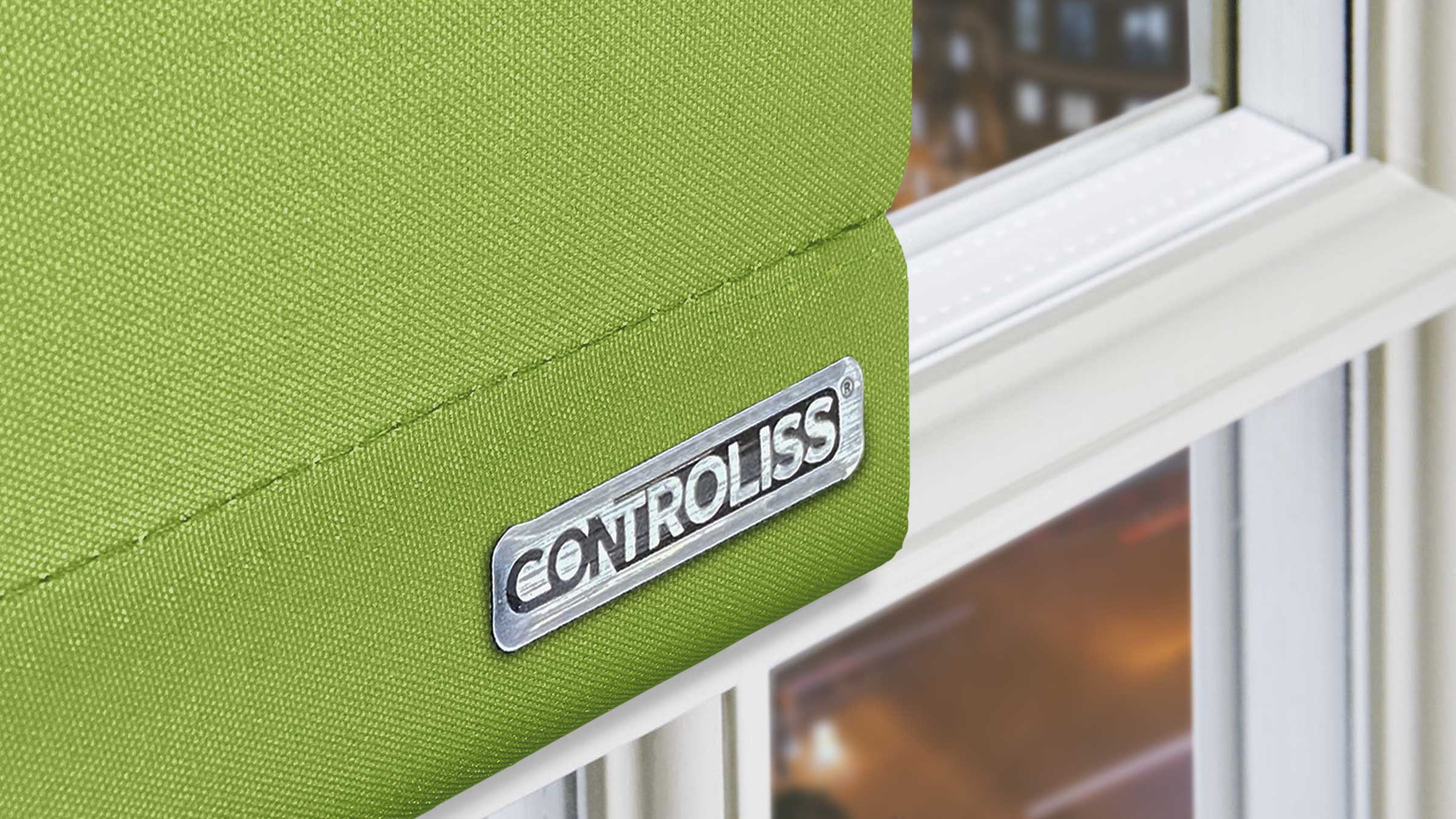
Controliss® branded products
The identity appears on each and every Controliss® product the customer receives.
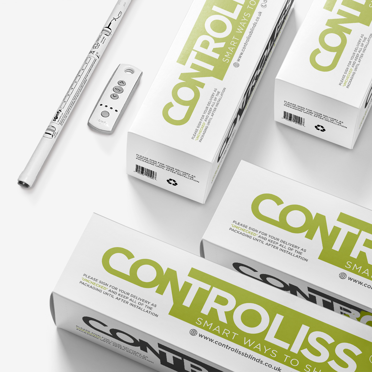
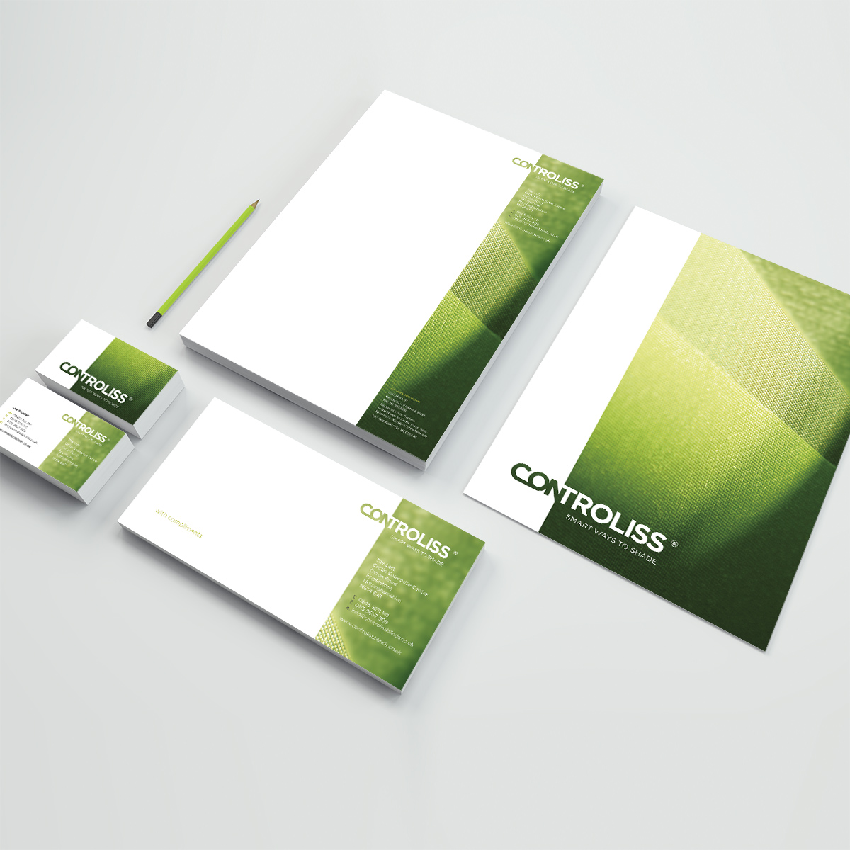
Controliss® product packaging and stationery suite
Consistency is king – at every touch point, the Controliss® identity is used to present a familiar and trusted personality, helping to build consumer confidence and loyalty.
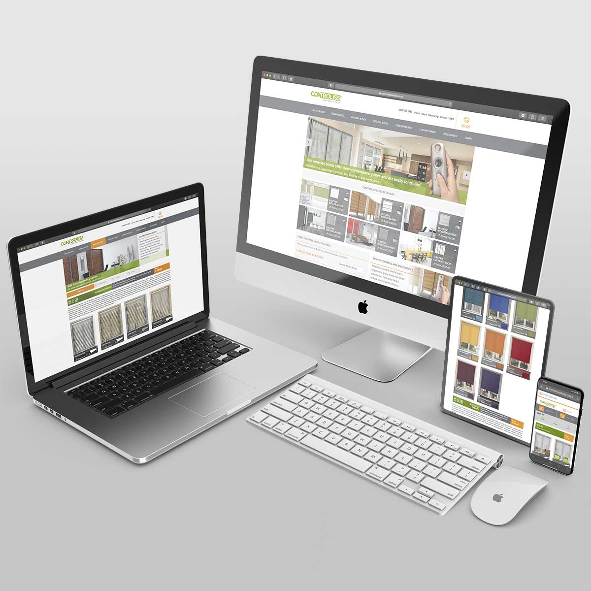
Controliss® responsive website design
Minimal application of the identity to the Controliss® digital marketplace ensures that the quality and character of the Controliss® product takes centre stage.
Other Identity projects…

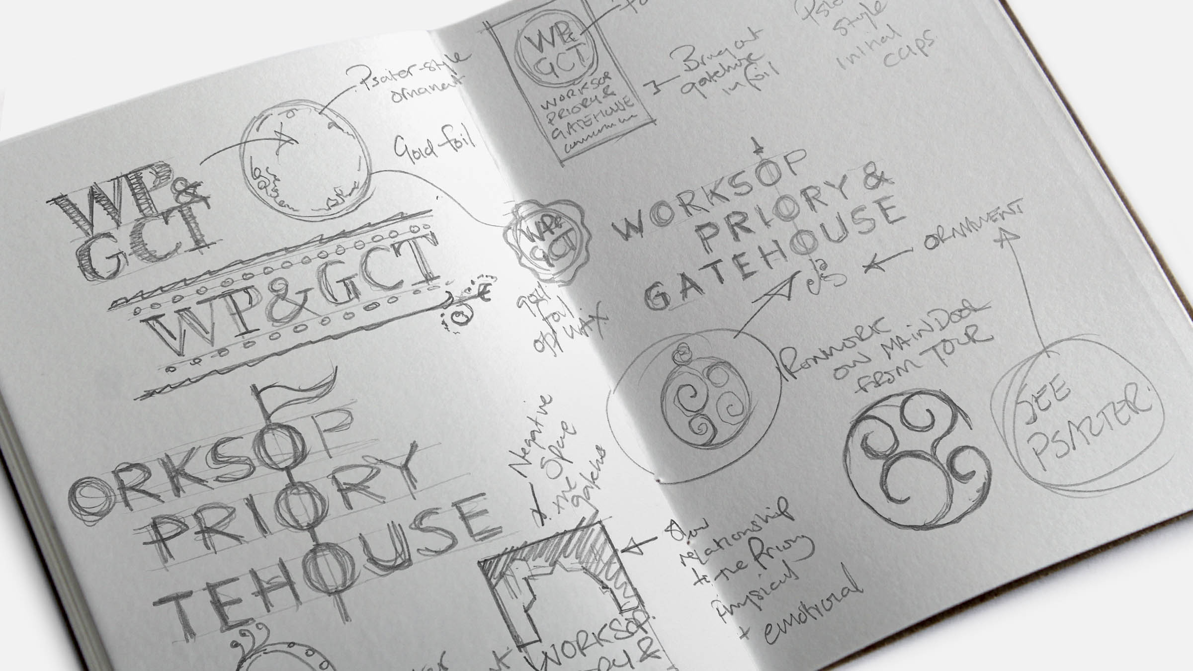
At Monkie, the only part a computer plays at the beginning of a project is for research. Our ideas are worked up by hand into genuinely relevant designs and never the product of the latest fad or Photoshop® filter.
Gillotts Funeral Directors
For an independent, family business able to trace its roots back to the Victorian era, maintaining a heritage look within a sophisticated, contemporary feel was the order of the day.
Traditional typography sits beneath an intricate keyline motif, reminiscent of period filigree business signage.
Worksop Priory & Gatehouse Community Trust
A simple yet sophisticated mark by which the Trust and its activities are identified.
Colours are drawn from the existing Worksop Priory heraldic style logo and establish a sympathetic and unifying bond.
The typography has a strong, traditional personality. This is combined with a representation of physical heritage, (the decorative ironwork on the main door of the Priory), by exploiting a fortuitous alignment of ‘O’s when the Trust’s name is stacked.
Professor Andrew J. Scott
With a degree of abstraction, Andrew’s initials are contained within three circles, representing the ‘dots’ he ‘joins up’ as part of asking and answering the profound questions he considers in his research, writing, and work.
Each dot is presented as a composite two-shape graphic, where the negative space ‘hole’ is Andrew (in the sense of his initials) – he ‘joins up the dots’, enabling the viewer’s eye to still make out the circle and understand the bigger picture.


Hodsock Priory
A delicate identity refresh to bring clarity and simple sophistication to a long-established mark in need of a more contemporary feel.
Colours are drawn from on-site heritage decoration, instantly recognisable upon visiting this north Nottinghamshire gem.
Blue Spire Ltd
From a brief of ‘slick, simple, blue, trust, traditional’, a refined and sophisticated design communicates the integrity and respectable nature of this independent financial services business and its owner.

Leo’s Wooden Toys
“I’d like it to be modern, but with a nostalgic twist; could we create a friendly face for the business; it needs to become the heart and soul of the business”.
Inspired by characters from our childhoods and given a hand crafted, contemporary look, along with a cosy colour palette and chunky, fun typeface.
The John Godber Centre
Vibrant colours and undulating lines, frame contemporary typography, in an identity which embodies the multi-faceted facilities and activities of this eponymous community centre.
Gifted to the community at the turn of the 20th century, The John Godber Centre stands as a beating heart within the town centre and focal point for a wide range of community activities ranging from sports, fitness and dance classes, through educational support, to theatrical performance, wedding and party celebrations, and St Mary Magdalene Church outreach.

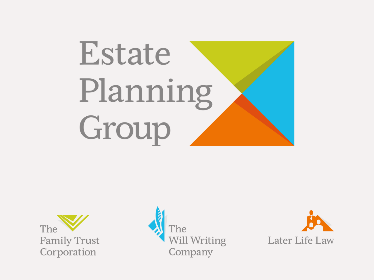
The Estate Planning Group
A group brand identity, representing a visual unification of the companies within the group.
Serving to demonstrate their strength and breadth of services to corporate organisations, it presents a contemporary image through the use of vibrant colour and clean, layered graphics, combined with traditional typography, symbolising longevity.
Its character is sympathetic and complimentary to the blue chip high street names with whom they partner and support. The logo is made up of two elements – the mark and the name. The mark represents the companies within the group. The name is written in full and creates an arrow-like negative space, leading the eye towards the mark.
